Game Design Research

March 1, 2023

Amir's article solidified my knowledge of design concepts by justifying why things are designed the way they are. For example, I didn’t think about why games animate the sliders from end to start at launched, but after reading this article, I realized that it was to bring awareness to the slider feature within the game.

I found that I had applied some of the best practices in my Every Picture project as well. In my project, I used delayed buttons, alternate copywriting for the “X” button, and semi-transparent backgrounds. These elements were meant to bring focus to specific elements and to keep users on the page for longer, but I didn’t know the same practices were used in mobile game design.

Some things I learned from the article was that draggable objects anchor points at the top left and the center because the user should be able to see the dragged object. Objects should also have a clear drop-zone and be pulled rather than pushed across the screen. I personally noticed these pain points in some of the games I played where I had to rotate my phone to see what I was dragging and to where because the object had a strange dragging point and the screen was too small to see the drop-zone that wasn’t highlighted. Pushing against the screen also felt off since it caused more friction compared to pulling. Amir’s article on the best practices for game design was super helpful and made me realize that there is a reason why mobile games look and feel the way they do.

Joanna Hu

Back to Portal
vinyl image

Visual Thinking Analysis

February 16, 2023
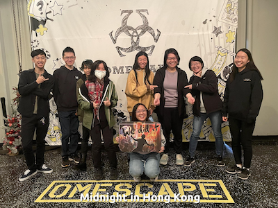
Image of Joanna and Joanna's friends at an escape room
Joanna @2023

This image is one of my friends and I's quarterly hangouts. We are never available at the same time, so this was one of the few where nearly everyone was able to make it. The topic of my collection is “Meet my friends", and this image encapsulates the vibe of the group and of each person. I plan to make an illustration as the main image for my project, but this image is a great reference photo. My collection is special because it’s rare to have a hangout where all my friends and I are present. We also never take photos of ourselves, and group pictures only happen during our annual escape room outings. Having a collection around us would be a nice memento to make up for it. Additionally, we have very distinct dynamics, which can be seen in the picture, and I think that would be fun to explore.

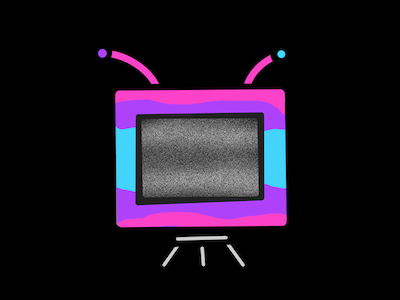
Laura's image for Studio Project 2
Laura E

I think Laura’s image is a logo or a piece from a personal passion project. The framing and symmetry in this image makes it visually appealing while the closeup and the contrast of the static draws you into the frame. The static is definitely the most interesting part of the image because it stands out from the other colorful 2D elements and builds anticipation that something will show up within the TV frame. The darkness of the background heavily contrasts with the colors of the TV as well, and it makes me think that something sinister will come out of the static. The TV stand is an interesting detail and looks like an E on it’s side, which makes me think it might stand for Laura’s last name if it was a logo.

Joanna Hu

Back to Portal
vinyl image

Close Reading and Visual Thinking

February 9, 2023

I am definitely one of the students who want to speed through assigned readings as fast as possible. In fact, I’m doing it with this article right now as I rush to complete this learning journal.

But, the article does make some great points. Closer analysis of text and information allows viewers to learn more about various things and build their curiosity and world view. As creators, we aim to grab the viewer’s attention to inform them of our work, vision, and thoughts, all of which is translated through our designs. Creating attention-grabbing visuals is ultimately what leads to opportunities for both the viewer and the creator.

I think the methods the article mentioned are also helpful. Asking open-ended questions and regular practice of curiosity helps develop the habit of close reading, and as designers, I feel like we regularly practice these skills.

One interactive site that inspires visual thinking and closer reading is Borraginol Town, a site that introduces a Japanese company and its history with clickable locations on a map. The graphics, animations, and lack of forefront information invites the viewer to explore the site at their own pace.

Joanna Hu

Back to Portal
vinyl image

Best Practices for Modal Windows

February 6, 2023

I have a habit of using modals and overlays in most of my designs, so I was surprised to find that they should actually be used as a last resort. A modal may disrupt the user experience by taking attention away from the main task on the page. Or, it might also be immedsiately dismissed as an ad. Instead, modals should only be used when grabbing the user’s attention, requesting user input, or showing additional information.

All modals should also have a way to exit, a title, clear CTAs, and be properly sized and placed on the page. In terms of interactions, modals should be the only element in focus on the page, and only show up after a user action. Most of these pieces seem common sense, but I often catch modals missing a few things as I’m iterating on my designs or critiquing other’s. Without one of these elements, the modal looks a bit lacking.

Something I didn’t know was that mobile modals are not recommended due to sizing accessbility issues. I am definitely guitly of including modals in my mobile designs, so I will be more careful the next time I’m designing on mobile screens. I’m curious as to what modal alternatives there are for mobile screens.

Joanna Hu

Back to Portal
vinyl image

Best Practices for Form Design

January 28, 2023

The design of forms is more nuanced than I thought. Most of the things mentioned in the article were fairly simple, but were also extremely effective in elevating a form’s user experience and accessibility.

Something that stood out to me was the best practices with input labels. I hadn’t thought of the consequences of including an inline label or placeholder text and what would happen if users were to use that input field. I also didn’t realize that making forms tab-ready had to be manually done as I had assumed that all forms would accommodate users using the tab key to get to the next input field. I was surprised to learn that the double password input was not giving users the option to view their passwords to look for mistakes. Despite how simple forms are, a lot of thought must go into their creation to make sure they’re user-friendly.

One example of good form design is Typeform, a site that lets you create minimalistic surveys and questionnaires using their site’s template. Their forms follows the auto-focus principle by showing only one input field at a time. They also show users which question they’re on out of the form’s total, thus incentivizing them to complete the form.

Joanna Hu

Back to Portal
vinyl image